Showing posts with label oil pastel. Show all posts

Saturday, November 5, 2011

Franz Marc results-6th grade

LOVE IT!!!

I don't think I've been this happy with the results of a lesson in a LONG time... this may go down as one of my top 5 fav lessons ever. Thanks to everyone who gave input into the lesson design process and for the many of you who expressed an interest in Franz Marc I would highly suggest using him as a spring board for student art.

I put a lot of class time/prep into this lesson and I think it was well worth it. I made two slide shows about Franz Marc...one more about his life and one more focused on looking for the elements of art in his work. Students had to follow along with handouts for both slide shows. They also had to work individually and in groups to brainstorm personality traits that went with 12 animals and 12 colors. We did practice coloring with the oil pastels to understand how to apply them thick and use value and we talked extensively about how to choose the colors we used in our work of art.

In the end each student had to choose an animal that symbolized them along with a color or selection of colors that symbolized them. They had to be able to write about AND verbalize to me why they choose both their animal and color before moving forward. I also asked for the animals to be in a position that related to the personality traits (crouched for shy, slinking for sly, looking upward for positive....so on). Each animal had to have light, med and dark of the color used. Each animal was to be in an environment and student's were to use the complementary color of their animal in either a space that touched their animal or in a large part of their background.

Beyond that I tried to back off and let each student draw in the style they wanted and go about coloring how they wanted. I did ask several students to outline their animals in black or a dark color so they would stand out. I wish I had asked this young lady to do so as her AMAZING dolphin is a bit lost in her equally cool background.

I was really surprised by how far the students pushed themselves and how inventive they were. Really I think with middle school students you get better results when you back off and give them some space to do their thing. They get so much more invested in the process.

To end it all I made them write a formal artist statement about their work....their least favorite part and come up with a title for their work....a part they did enjoy. This lesson re-confirmed my belief that Crayola oil pastels are superior to all others that working on either letter size or a tinny big bigger sized paper is perfect for most middle school student attention spans and that the more choices you give a student regarding a lesson the better things will turn out.

I will admit to meddling in one part of this lesson. Many students just could not draw big enough to make a good composition. I admit I took about 75% of the student drawings to the photocopier and enlarged them. I feel ok with this choice. I also allowed students to look at a LOT of how to draw books to help them draw their animal.

I really hope a lot of the kids will choose this to be their work of art that hangs in the spring art show...but I won't pressure them because I really want it to be their choice.

Monday, August 22, 2011

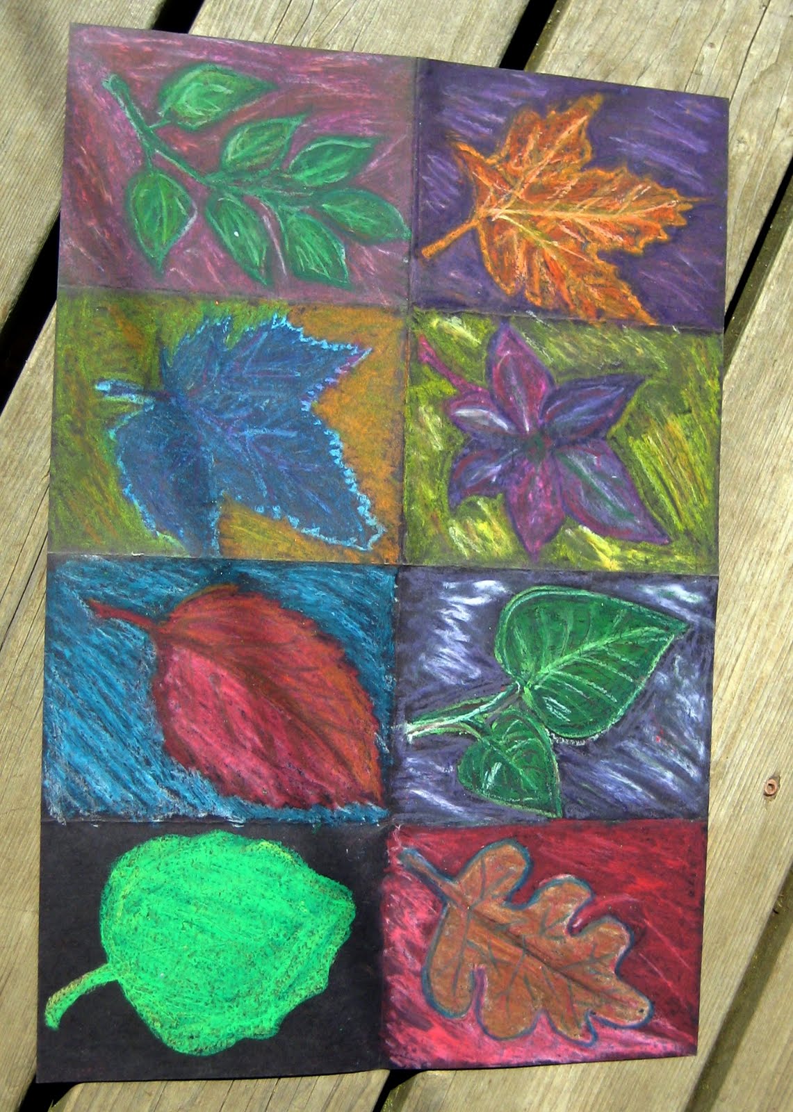
the bucket day 2 - fall oil pastel

A lesson for 3rd grade and up. A good back to school/fall lesson.

Today the bucket brings us another lesson from my student teaching...this one passed on to me from my supervising teacher. I go between liking it and feeling indifferent towards the lesson. And the thing that makes me swing back and forth is the type of oil pastel we use. As I've said before...I hate to call out one brand over another but I find the only oil pastel that really stands out on BLACK are the Crayola hexagon oil pastels. Sorry other brands.

Obviously you can see we have taken a, rather large, sheet of black construction paper and divided it into 8 spaces. Once again size matters. If I were to do this again we would aim for somewhat smaller paper and only six spaces. 6 is great...8 equals burn out. In each example the student burnt out before the end.

The original lesson, as seen above, and flipped because blogger hates me, was intended to be a study of complementary and secondary colors. Students looked at real leaves, drew one in each box and then used oil pastel to explore color. I started requiring white to be used in addition to the color in the background of each box. I also started requiring a neighboring (analogs) color to be used in coloring the leaf itself in each box.
These small changes made a big difference in the visual interest of the work.


Now if we go back to this sample...done with 7th graders, you can see I had branched out into other fall items such as mums and zinnias, gourds and a hard to ID wheat stalk. I feel the gourds and zinnias made a great addition to the leaves as they still have simple shapes but things like the wheat stalk and whatever blue flower was drawn in the upper left hand corner are getting to detailed and monochromatic.

Overall thoughts:
*Pick your oil pastels wisely and test on black paper first
*Go for a slightly smaller sheet of construction paper
*Divided into six instead of 8 boxes
*Draw your item big enough to almost fill the box
*Arrange items at an angle if possible
*Stick with bold, simple shaped fall items: leaves, gourds, sunflowers, zinnias
*Outline the edges of your item with either a dark color or white to make it pop
*Emphasize complementary color pairs and secondary color pairs to help the colors pop
*Encourage use of white in the background at the end
*Encourage use of either a analogous color or tints and shades of the main color inside the leaves


Tuesday, April 12, 2011

The figure 5 in gold


I stole my husbands nice camera and took it to school to take some photos...he wasn't super happy but I got some new photos to post;)
A while back I had the 2nd and 3rd graders look at the work I Saw the Figure 5 in Gold and read and listen to the poem that goes with the painting The Great Figure.

I put a picture of the original painting, a copy of the poem and a explanation of the project up on the bulletin board. No school staff or admin seemed to notice the display but a few parents read the poem and some kinder, 4th and 5th graders spent time looking at it so that is something.

When looking at the original painting I had students look for shapes, colors and lines. We found the hidden fire truck and talked about how the artist used diagonal lines to make it look like the fire truck was moving fast. Next we brainstormed our favorite number and drew it LARGE on 8"x 14" paper. Students could color in their number with oil pastel or wait to paint it with watercolor.

Next we talked about repetition and unity. We drew our favorite number small three or 5 more times around the paper and then added three circles in various sizes. I had students color their circles in with oil pastel. Then we used DIAGONAL lines to dived our paper into smaller spaces.

The next class we re-read the poem and reviewed the elements of art we found in the painting. Then I had students use watercolor to paint their background spaces. They could choose one area on the paper that I would paint with my forbidden 1970's gold powdered tempera paint that I keep hidden in the back of my cabinet.

The project was perfect for both 2nd and 3rd grade but the paper was too large for the 2nd graders. Next time I will use standard letter size paper for 2nd grade and the larger paper only for 3rd grade.
click to enlarge

I think this lesson is a great way to combine art, math and literacy!

Monday, March 28, 2011

camouflage critters


I feel no shame saying, that like many of you I love this book:

I have used a lot of lessons straight from this book. The kids like the lessons and are willing to work hard on them. A few lessons use materials that are hard to get, hard to work with or not practical but overall I think it's a great book.

So one of my favorite lessons is the camouflage critters. I've done this lesson in the past with sharpies and tooling foil but this year we just used construction paper, tempra paint and oil pastel.

After having the kids divided the paper with white paint (use the smallest paint brush you have) the paint dried fast and I hit each kids paper with the hair dryer for 15 seconds and sent them back to their table to use 3 colors per section to make an interesting background. Some kids used only 3 colors for the entire background and others used all sorts of colors. This part takes about a class and half.

We spent some time practicing the animals in the book and going through the step by step drawing directions. The kids really liked learning to draw the chameleon (although they are not the easiest animal to cut out later and many kids opted for a turtle for their final drawing)

When the background is done we drew our animal on a second sheet of black paper and repeated the painting and coloring process. Some kids understood to match the pattern on their background and others were not that careful.

finally I had the kids cut out their animal and bring it and the background to me where i used cut up pieces of foam glued to the animal to make the animals pop off the page. 3rd grade results were ehhh but 4th and 5th grade results looked awesome.

YET when I sent these back to the classroom their homeroom teacher had to fish most of them out of the trash because once again the kids refused to take their art home saying it would just get thrown away there! Good lord why do I even bother!!???

Friday, November 26, 2010

4th grade owls


Our 4th grade project was a dumbed down version of this stunning lesson from That Artist Women. I honestly don't have her skill level with watercolor painting but I sure like to try her projects myself to help improve my own skills and then simplify them for my kiddos.

This project started back when I was out sick and I had two different subs do the drawing of the owl with the kids. I had the sub follow the how to draw owl sequence I posted back in my owl project idea post. I still don't know where the drawing sequence came from! Anyway I had left a stack of card stock with the first step, a letter W in the place and in the size I wanted the kids to stick to. It must have worked out because 95% of the kids had a usable drawing when I got back.


During our next time together I had the kids use a sharpie to go over their pencil lines. Then we used brown oil pastel to add feather and branch texture to our owls. Next I gave them a white oil pastel to draw leaves in the background. Some kids were too frustrated with the white and used yellow instead and that worked out looking pretty good also.


During our third session we painted our owls and used the warm colors to paint the background. Some kids asked to add splotches of green and I said that was Ok. We also talked a bit about analogous colors and why owls would be brown like the trees they roosted in (aka what are the advantages of camouflage) then we talked about what snow owls would be white...camouflage and adaptation. Just a nice little science tie in. I asked the librarian to read Owl Moon to the kids to go with the project but she never got around to it. Oh well...so goes it when you only have class for 20-ish min at a time.


stage fright and oil pastel landscapes


Well in the last week I have amassed over 100 followers who now look at my blog. I also got put on another top blog list. To some this might mean blogging victory...to me it means stage fright. I started this as a place to keep my lessons and vent. Then as a place to record for myself what the students artwork looked like from year to year. I feel like the more people who read my blog the more awesome it needs to be, the more insightful the dialog, the more impressive the projects and end result from my students. That is not really pressure I am looking for. Hence my stage fright. I'm also feeling more hesitant to talk about my personal struggles at my school. The more people reading my blog the higher the chance that someone will suss me out and rat me out to my school/my district? Then again, it seems of all the people who read my blog who show their personal info the closest person is in Seattle...well aside from a few of my personal friends. So I'm probably being paranoid. For now I will try to pretend/hope that only 20 people actually read my writing and the rest just scan my photos for lesson ideas and move along.

Onto the art. The oil pastels I can buy from my district wear house drive me nuts. I've always been unhappy with their lack of vibrancy, lack of coverage, how absurdly fast they are gone and how easily they break and the fact that they wont blend. To me a major part of using oil pastels is their ability to blend giving you new colors and a painterly effect. With my district ones one color just slides over the other or balls up. Very frustrating. To my great joy the kindergarten teacher was cleaning out her closets between conferences on Tuesday and found some boxes of Crayola oil pastels that a parent had brought in years ago. She did not want them and gave them to me. I promptly tried them out (the octagonal ones) Wow! I hate to be a brand whore but those Crayola's are a LOT better than the school's generic ones. I know what I will be using my next five weeks worth of Jo-anns coupons buying.

To the project at hand. It is a good standby for teaching landscape, warm and cool colors and using up the little bits of old oil pastels. I usually do this project with 3rd grade as they have the small motor control to draw with the glue. This lesson took 1 20 min session and 1 35 min session. We started by talking about foreground, mid ground and background. We made a practice sketch on white paper. We make a wave line at the bottom of the paper. Then we added hills/mountains for the mid ground. Finally we made a circle in the background and used concentric circles to fill the sky area.

After they made their practice sketch I gave each student their black paper and had them make their final drawing with pencil. I then showed them how to go over their lines with white glue. I emphasize that the tip of the glue bottle MUST touch the paper or the will get a blobby mess.
Set the papers FLAT to dry. During the next session I had the kids use the left over bits of oil pastel to color the for and mid ground in cool colors and the sky in warm colors. In the past I have let the kids choose to use cool colors in the sky and warm on the ground. Either way looks good. Lots of people use chalk pastels for this lesson, but then you have to spray to fix.