Showing posts with label drawing. Show all posts

Wednesday, November 9, 2011

waiting for baby and sunflowers

Not my best photos ever....sorry. The colors are much brighter in real life.

Tomorrow is the big day, the due date of my first child. Of course we know babies rarely come on their due date so we are not getting our hopes up. My husband really wants an 11/11 or and 11/12 baby. I don't even know what to think at this point. Especially after my Dr. appt LAST Tuesday when the midwife told me...and I quote..." I will be shocked if you don't have the baby by Monday!". I got so excited and spent all of last week waiting and prepping to leave my classroom. On Sunday night I started to feel really strange and icky...like I was getting a flu or a cold, hadn't I read that feeling like you are getting a cold/flu is a sign you are about to go into labor! I called my maternity sub and asked her to go in for me the next morning and went to bed thinking I would wake up in the night in labor.

Turns out that strange, sick feeling...yah that was me getting sick... not having a baby. Having a nasty cold is never fun, having a cold when 39 weeks and 6 days pregnant is not fun at ALL.
For me the hardest part has been staying home sick. I never stay home from school...I admit I went to teach while I had the swine flu a few years ago. I went to teach the morning I found out my dad had died last year. So far in my pregnancy I had not missed a single day of teaching.
keep reading and you'll get to the lesson...

I'm not a callous, germ spreading, horrible person. I just can't really relax the way most people can. Being occupied is what helps me get through things and what keeps you more occupied than teaching! However, I knew that with my due date this close I had to walk away from my classroom, stay home and get well ASAP. I also was about to snap from the adults at the school asking me if I should be there and if the baby had come yet. Hello, if I am still standing here and my belly still looks like I swallowed a beach ball then NO I have not had the baby!
keep reading...

My poor sub has had to put up with pages and pages of overly detailed and controlling lesson plans and "suggestions". I'm sure she is equally ready for me to have the baby so I don't have hours upon hours of time to be fixated on my classroom.
I'm bummed I won't be able to post all the lessons going on in my room while I'm gone. Maybe I can talk her into taking some photos .
now for the lesson!
I realized I never posted this sunflower lesson that we did in September and is heavily inspired by Gail at That Artist Women and this lesson. We know I hate chalk pastels so I make sure to to at least one chalk pastel lesson per term so I don't create another generation of students that hate them. So we did Gail's glue resist sunflowers and then we zoomed in. I wanted the kids to work on their OBSERVATIONAL drawing skills so we really observed one sunflower petal and then zoomed in one more time to view the veins of a sunflower leaf. We used oil pastel and watercolor for these zoom ins. All three parts were mounted onto a big sheet of construction paper. Man these photos did not turn out well. I promise the looked good in person. The kids really liked taking apart the sunflowers to observe like scientists. I think it would be really cool to do this with a fruit or veggie where you could do some dissecting or flowers like Lilly's or maybe a small household appliance like a clock or toaster. I bet that would really interest some young men (and women) to take apart and draw a broken toaster or game controller.

you know the deal...click to enlarge

Tuesday, September 27, 2011

first lessons...the good and not so good


For the first lessons of the year I wanted something that had to do with names or first initials. I also wanted to use limited supplies and see where my new student's skill levels were.

One class made radial name designs that many people have done before and posted about. I remember doing these when I was in 6th grade. As always they turned out well.


My other two classes were supposed to think about pattern and balancing positive and negative space by making Zen Tangle initials. I think this lesson could be a winner but I let things get a bit out of control and ended up with mixed results. First I had students make bubble or block initials. This part went just fine. Then I had students brainstorm different patterns and gave some pattern idea sheets to each table. Students needed to divided their letter into 5 or 7 sections and draw a different pattern in each section. I limited them to black and white (so sharpies). Things were still going ok at this point. I kept having to encourage the kids to use a balance of black along with the white in each pattern but that is normal. If I had stopped the lesson here things would have been great. Here is a student who didn't get around to my next step. (He was working really hard and did a great job)

and another nicely done letter


But then I just could not leave well enough alone. I wanted the kids to make a boarder around their letters and when I found scraps of e-z but lino I decided they should carve stamps. I must say they did a pretty decent job with the carving...but the stamping got pretty messy. I realized my new room didn't have any brayers (even though I found tons of other printmaking materials...where did the brayers go?) So we ended up brushing on tempera paint. Then I had some kids brush on printing ink. Some of these turned out ok...
would have worked better with correct printmaking materials...but overall ok
same thing... tempra paint is not our friend here... otherwise great stamp and letter
cute little owl stamp
found the printing ink! Much better!!

But then my third class just made a mess of theirs. I had them work on colored paper with black paint so I could keep the classes separate for grading. They got black paint all over, stamped half on and half off their papers, didn't bother spacing their stamps....who knows. Each class has their own personality I guess. Let's call some of these the not so goods....
ok letter...not ok stamping
again very messy stamping
and MORE messy stamping! yet the letter was so well done.

Yahheee... a good letter and good stamping...one of only three from this class

I still think this lesson has great potential. Either just do the letter and stop or make sure you have the correct printmaking materials and have the kids practice stamping and spacing a lot before you let them have at it. I still don't know why one class ended up with such sloppy work while the other class was simply hindered by my lack of correct supplies.

Thursday, September 8, 2011

the bucket day 4 - Eat your fruit! and my new job


Two years of blogging (can you believe it!) has taught me lesson first then ramble. So let's get back into the bucket for another lesson.

Today I bring you what I feel is another classic lesson but one that I haven't seen posted recently. Lets call it, "Eat your fruit." Eat your fruit is a classic observational drawing lesson with a twist and a motivation...you eat your subject matter. I feel Eat your fruit could be used from K-12. Seriously. This is a great way to examine sequencing with younger students. I think it would make a nice tie-in to K-2nd students who are talking about tracking the series of events in a story. You could do only three drawings. One with the fruit at the start, one with the fruit with a bite or two gone and one with the leftovers of the fruit.

At the middle and high level it is also a reminder that there are smaller steps that happen between the beginning the middle and the end of a story. The drawing above actually goes with a claymation unit I do. Before I let the kids start with the claymation I ask them to really think about story sequencing and how with any form of animation you must use many frames with only small changes to create a story.

After doing this lesson several times I think 6 "cells" is the best # for a middle school attention span and class length. I also favor colored pencil, watercolor pencil or crayon as the media for coloring. When doing this lesson you need to eat and draw on day one. You WILL run out of time if you eat, draw and color (unless you have a double block period). So there is an issue of when you go to add color the next class your fruit is no longer around. I have found three possible solutions for this issue.
1. Have a new piece of fruit for the student to look at for color
2. Have the student photograph their fruit before they start to eat it and once when you can see the inside colors
3. Make the students make notes to themselves about what colors they observe while doing the day one drawing. Have them lightly mark highlights and shadows. Basically artist journal approach.
I use this lesson to really push for shadow, highlight and shading to show form.

OH YEAH! Beware if you use grapes...the kids will take FOREVER to draw them. Also drawing the skin texture of oranges can drive a lot of students to the breaking point.... if you want an interesting internal texture I suggest a kiwi instead.

Of course if you have some students who need a challenge break out the watercolor or acrylic paints. I had these two young ladies work in acrylic paint last spring and they made some nice fruits.
(7th grade student who really "gets it")
(6th grade student who wanted a challenge)

As for my new job...knock on wood, don't want to jinx anything but it is 100000000x times better than my old position. The fact that I only have to prep for three grade levels is making a huge difference in my ability to focus, get work done, keep track of what I am doing, what I have taught and plan better instruction. The fact that I'm only teaching 1/2 time is a huge relief on my 32 week pregnant body. The students are way nicer and more focused and so far I have had very little behavior issues. Granted it was just the first week of school but hopefully they will be engaged enough in the lessons to keep from having any major behavior issues. I also laid down the law early on and have not let anything slide. The only thing I am not a huge fan of is the school policy that no student is allowed to go to the bathroom during class. They are supposed to bathroom during their 4 min passing period....but the school is 4 floors high and it takes all 4 min to get from one place to another. I feel telling a student they can't bathroom when they naturally need to is borderline abusive. Until I see students abusing the privilege I am allowing them to the bathroom across the hall from my room.

As for my baby belly...it is getting pretty big but I still feel like I have good balance and am able to sleep at night as long as I don't nap during the day. While my belly measures on track and the baby is gaining weight as he should, I personally am struggling to gain any weight. I now have to eat two tablespoons of peanut butter a day on top of my other calories in an effort to up my protein intake and put on a few pounds. Otherwise I have to start drinking supplement shakes like Ensure. Ick. Squirmy, as we call him, makes me NOT want to eat sugar or junk food. I have zero cravings other than fruit. I think he takes after his vegetarian father and I hope he keeps up the healthy eating habits when he is outside of the womb....I doubt I will be able to!
(sigh, no I am not naming his Clay or Art...its getting old people)

Thursday, August 25, 2011

the bucket day 3 - pop art shoe


Ah the contour line drawing of your shoe. Can't get more classic art class than that. And it is a classic for a good reason. Working on contour line drawing is a huge stepping stone for student's to be able to realistic draw people and objects. Contour line drawing expands student's grasp of line, shape, proportion and form. In my mind Picasso was the King of awesome contour line drawings!

Of course there is blind contour line drawing and pick up your pencil vs. one line contour line drawings. I think it is great to practice sighted, unsighted, pick up your pencil and "No picking up your pencil!" of whatever object you are drawing before you get to the final project.

When doing a sighted contour line drawing I tell the kids to imagine their eyes and pencil are directly connected. Your eyes should be tracing the object SLOWLY....like a snail creeping along its contours. As slowly as your eyes are tracing you hand should also be moving. Perspective and proportion get off when either the eye or the hand get ahead of one another.
heheh! from Inner City Snail....a awesome artist/ art movement

But what do we do with that completed contour line drawing before putting it on display? I usually make the kids ink over their pencil lines with micro sharpie and then create a background. For this 6th grade wheel lesson...where we are short on time and trying to hit as many skills as possible, we took a pop art approach to the background.

Students are asked to find two shapes, lines or patterns that occur in their shoes design (can be from any part of the shoe...even the tread...we don't have to see it in the line drawing). They need to take those designs, enlarge them and create a pop art style background with the knowledge that it will be painted.
BLOGGER WHY WHY DO YOU DO THIS!!!!

The backgrounds get painted while learning how to crate tints and shades. While some years I have allowed tinting and shading of a single color, I find a black, white and shades of gray background tends to produced the best end result. I require at least three shades and say white may be used but no straight black. That is because I want everyone outlined in sharpie when the painting is done.

oh I give up with the photos and the rotating and such.

When the background is painted and dry, we carefully cut out our shoe and glue it on for the finished work of art. Ta da!

P.S. I provided a collection of shoes that students can choose to draw from so they don't have to take off their own shoe if it makes them uncomfortable. Stinky feet and such.

Monday, August 22, 2011

the bucket day 2 - fall oil pastel

A lesson for 3rd grade and up. A good back to school/fall lesson.

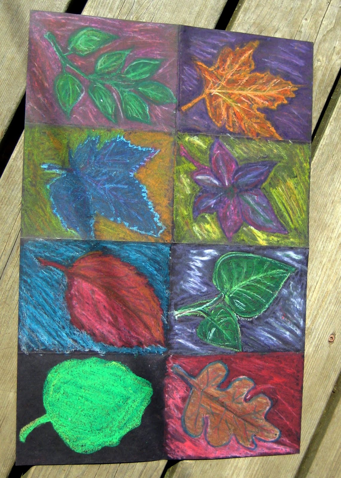
Today the bucket brings us another lesson from my student teaching...this one passed on to me from my supervising teacher. I go between liking it and feeling indifferent towards the lesson. And the thing that makes me swing back and forth is the type of oil pastel we use. As I've said before...I hate to call out one brand over another but I find the only oil pastel that really stands out on BLACK are the Crayola hexagon oil pastels. Sorry other brands.

Obviously you can see we have taken a, rather large, sheet of black construction paper and divided it into 8 spaces. Once again size matters. If I were to do this again we would aim for somewhat smaller paper and only six spaces. 6 is great...8 equals burn out. In each example the student burnt out before the end.

The original lesson, as seen above, and flipped because blogger hates me, was intended to be a study of complementary and secondary colors. Students looked at real leaves, drew one in each box and then used oil pastel to explore color. I started requiring white to be used in addition to the color in the background of each box. I also started requiring a neighboring (analogs) color to be used in coloring the leaf itself in each box.
These small changes made a big difference in the visual interest of the work.


Now if we go back to this sample...done with 7th graders, you can see I had branched out into other fall items such as mums and zinnias, gourds and a hard to ID wheat stalk. I feel the gourds and zinnias made a great addition to the leaves as they still have simple shapes but things like the wheat stalk and whatever blue flower was drawn in the upper left hand corner are getting to detailed and monochromatic.

Overall thoughts:
*Pick your oil pastels wisely and test on black paper first
*Go for a slightly smaller sheet of construction paper
*Divided into six instead of 8 boxes
*Draw your item big enough to almost fill the box
*Arrange items at an angle if possible
*Stick with bold, simple shaped fall items: leaves, gourds, sunflowers, zinnias
*Outline the edges of your item with either a dark color or white to make it pop
*Emphasize complementary color pairs and secondary color pairs to help the colors pop
*Encourage use of white in the background at the end
*Encourage use of either a analogous color or tints and shades of the main color inside the leaves


Wednesday, August 3, 2011

2-D to 3-D part 3

Part 3 of ideas for 2-D to 3-D lessons

My new school still has a shop/industrial arts class (isn't that amazing!) so I'm hoping to scavenge some scrap wood to use as a base on the classic coat hanger, stocking, and house paint sculpture. These sculptures are sure fun to make and the overall shapes are almost always interesting. However, I find that painting them to be the least successful aspect. We have tried painting the sculptures with one pattern all over or with variegating color or while trying to chase the "planes" of a very mesomorphs shape. The end result is very hit or miss.

Now I have two new ideas to try. First off...and I don't know where I saw it, but someone had their student's paint their sculpture with aboriginal dot designs which was really cool.
Second, I remember one of my supervising teachers having talked about this idea but never saw a sample but I found a few examples on this site. What a cool idea...making the sculpture into a Picasso/cubist style face.

Picasso faces and stocking and wire hanger face sculptures from Waunakee Middle School (so many great ideas!)
Also I think it's a good idea to pause after you have just painted the sculpture white and trying to do some value/shade study drawings before you add color to the project.

On the 2-D side there are unlimited lessons for Picasso/cubist face lessons...from the simple to the very complex.
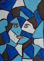
here are some great examples from Hannah at Art.Paper.Scissors.Glue! (great thoughts her way as she is taking on 7th graders for the first time this year:) )
We will see if this new batch of kids resists doing anything with their photo as much as my past students. If so we usually do a similar project but with animals instead.

Speaking of animals I love any project that allows students to choose their own animal to make art about. Animal, fish, reptile, bird...whatever. Now whenever you are talking animals it is a great time to talk texture. Of course we can use shading to create implied texture or we can tap our inner 2nd grader and make a ton of textured papers to make Eric Carle style animal collages.
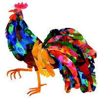
Before you poo poo this as too juvenile for middle school or even high school students think twice. Real problem solving work goes into breaking a large image into smaller shapes.
I require at least five papers to be used in the collage and each animal needs to be broken down into at least 5 sections...fantasy colored animals are fine and you need to go back and work some oil pastel into the finished product.
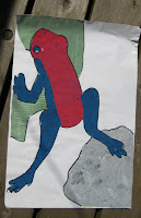
not done yet....but a great start!
And onto the 3-D. Due to my kiln limitation I haven't done with in years but my good friend, who happens to be an excellent art teacher and guest teacher extraordinaire, tackled this lesson with some young men and women this summer. Look at their amazing results.
she suggest using acrylic paint instead of glaze and a modified wash method which I think is a great idea and allows students to control color, detail and eliminates some of the risk that goes with double firing and glaze firing a thin tile. (A- if you want me to link to your blog or put your name let me know...trying to protect your privacy unless you ask otherwise:) )

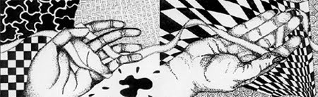
Warping things up with today's 2 to 3-D ideas lets take a look at a lesson often referred to as "Common threads." I've seen this lesson done by several teachers but I think I have tracked the original idea to Bunki Kramer of Los Cerros MS. I don't know if she still teachers, but there are amazing lessons on her school website.
some images of HER student's amazing work on the original lesson
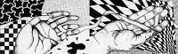
I know it is a little fuzzy but do you see how the ribbon goes between and around each students hand/fingers and connects to the next student's drawing? The ribbon links all the students drawings and then she made a copy of each students drawing for everyone in the class and they assembled them into books with everyone's hands. Pretty cool!.
So I have done this lesson 3 times now. Sometimes in black and white and sometimes in color. I almost always let the kids do the hand shading with pencil so they can erase. Sophie Wagner Max back at Waunakee Middle School again has students use textiles from around the world to inspire their backgrounds.
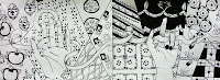
(click to enlarge)
Size matters with these. If you use to large of paper the kids get board with making the background textures and poop out. I suggest sticking to copy or 11"x14" size paper.

I once got a bag of fancy scrapbook paper scraps and had students choose 3 and glue them into the background and then continue the design in colored pencil. I liked this method because it brought color into the work and reduced the amount of background drawing the kids needed to to.
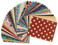
I've been using a $10 pack of these papers for this lesson and book making for 5 years now. Good investment.

Of course you can also do contour line drawings of hands spelling a word in sign language...students like learning and drawing the finger spelling but I'm still working on how to get a nice background or boarder around the hands.
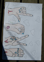
Why does blogger do this rotating thing sometimes!!!!!???

For the 3-D part we are gonna plaster cast our hands! But it's so expensive you say! About $2 to $3 per kid depending on where you get the plaster. Less if you plan ahead and work those Jo-anns and Michelle's coupons.
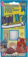
I've always used Activa Rigid Wrap along with lots of Vaseline and have had no problems. Word on the street is that you can get plaster cast strips from medical supply places and that might be cheaper. I need to look into it.
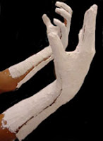
(NOTE) Casting one side of the hand and stopping at the wrist is enough and keeps the kids from getting stuck in the plaster. DO NOT stick a kid's hand into a bucket of plaster of Paris!
This is the only time that I ask students to kick in some $. Without fail, even at my 87% free and reduced lunch school, if I give students enough warning they can scrape together a few dollars. I find parents are willing to contribute for this lesson because it permanently captures their child's hand during the adolescent years when they are no longer getting hand print mother's day plaques.

I send a note home explaining the lesson, requiring a parent signature saying its ok to cast their kid's hand and asking for a $1 -$3 to help off-set the cost. No parent permission slip no casting. No exceptions. We cast over two days so if you forgot day one you can help someone else cast their hand and you have a chance to get the permission slip in for the second day.
Nice work! Done by HS level student over at A faithful attempt
How to decorate? That's the fun and the trick. Like the coat hanger/stocking sculptures these can go downhill during the painting process. When casting the hand remind the students repeatedly to smooth the plasters to they have a smooth surface to paint on later. Make sure students have a drawn out plan before they start to paint. I've started to require a simple symbol or image be incorporated into the design. It would be great to take one of the patterns from the common threads background and paint the hand that way. Animal prints work well sometimes...if done well. Some students have painted mendi like designs that take time and and a paint pen but look nice.
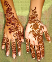
this may be a good time to break out the sharpies but make sure to let the plaster cure (dry) for a few days before you paint. Our other favorite use for this project is to "mummify" our hands at the end of our Egyptian unit and then paint a single Egyptian symbol, one hieroglyphic or an entire name in hieroglyphics.

There you go...on a A/B day schedule I think I've now posted enough lessons to go an entire semester if not more. Still looking for your favorite way to go from 2-D to 3-D. Up next....How to make large 3-D cardboard letters.