Wednesday, September 21, 2011

what do you call this?


Thanks everyone! We have the right word now...it has been agreed that this gradation. Or gradating colors.

I'm having an art vocabulary issue. We have been looking at the work of Peter Max and I can't come up with the right word for when you move from one color to another color in small steps when painting. With adding white you would call it tinting, when adding black you would call it shading, but let's say we are moving from yellow to red and making yellow orange, orange and red orange along the way. It's not monochromatic.... I keep calling it verigating but I'm not sure if that is the right word. I know how to teach it but I don't know what to name it!
Please help:)

Thursday, September 8, 2011

the bucket day 4 - Eat your fruit! and my new job


Two years of blogging (can you believe it!) has taught me lesson first then ramble. So let's get back into the bucket for another lesson.

Today I bring you what I feel is another classic lesson but one that I haven't seen posted recently. Lets call it, "Eat your fruit." Eat your fruit is a classic observational drawing lesson with a twist and a motivation...you eat your subject matter. I feel Eat your fruit could be used from K-12. Seriously. This is a great way to examine sequencing with younger students. I think it would make a nice tie-in to K-2nd students who are talking about tracking the series of events in a story. You could do only three drawings. One with the fruit at the start, one with the fruit with a bite or two gone and one with the leftovers of the fruit.

At the middle and high level it is also a reminder that there are smaller steps that happen between the beginning the middle and the end of a story. The drawing above actually goes with a claymation unit I do. Before I let the kids start with the claymation I ask them to really think about story sequencing and how with any form of animation you must use many frames with only small changes to create a story.

After doing this lesson several times I think 6 "cells" is the best # for a middle school attention span and class length. I also favor colored pencil, watercolor pencil or crayon as the media for coloring. When doing this lesson you need to eat and draw on day one. You WILL run out of time if you eat, draw and color (unless you have a double block period). So there is an issue of when you go to add color the next class your fruit is no longer around. I have found three possible solutions for this issue.
1. Have a new piece of fruit for the student to look at for color
2. Have the student photograph their fruit before they start to eat it and once when you can see the inside colors
3. Make the students make notes to themselves about what colors they observe while doing the day one drawing. Have them lightly mark highlights and shadows. Basically artist journal approach.
I use this lesson to really push for shadow, highlight and shading to show form.

OH YEAH! Beware if you use grapes...the kids will take FOREVER to draw them. Also drawing the skin texture of oranges can drive a lot of students to the breaking point.... if you want an interesting internal texture I suggest a kiwi instead.

Of course if you have some students who need a challenge break out the watercolor or acrylic paints. I had these two young ladies work in acrylic paint last spring and they made some nice fruits.
(7th grade student who really "gets it")
(6th grade student who wanted a challenge)

As for my new job...knock on wood, don't want to jinx anything but it is 100000000x times better than my old position. The fact that I only have to prep for three grade levels is making a huge difference in my ability to focus, get work done, keep track of what I am doing, what I have taught and plan better instruction. The fact that I'm only teaching 1/2 time is a huge relief on my 32 week pregnant body. The students are way nicer and more focused and so far I have had very little behavior issues. Granted it was just the first week of school but hopefully they will be engaged enough in the lessons to keep from having any major behavior issues. I also laid down the law early on and have not let anything slide. The only thing I am not a huge fan of is the school policy that no student is allowed to go to the bathroom during class. They are supposed to bathroom during their 4 min passing period....but the school is 4 floors high and it takes all 4 min to get from one place to another. I feel telling a student they can't bathroom when they naturally need to is borderline abusive. Until I see students abusing the privilege I am allowing them to the bathroom across the hall from my room.

As for my baby belly...it is getting pretty big but I still feel like I have good balance and am able to sleep at night as long as I don't nap during the day. While my belly measures on track and the baby is gaining weight as he should, I personally am struggling to gain any weight. I now have to eat two tablespoons of peanut butter a day on top of my other calories in an effort to up my protein intake and put on a few pounds. Otherwise I have to start drinking supplement shakes like Ensure. Ick. Squirmy, as we call him, makes me NOT want to eat sugar or junk food. I have zero cravings other than fruit. I think he takes after his vegetarian father and I hope he keeps up the healthy eating habits when he is outside of the womb....I doubt I will be able to!
(sigh, no I am not naming his Clay or Art...its getting old people)

Saturday, September 3, 2011

3-D letters


Finally! I have promised for weeks and now to celebrate the start of the new school year I present....recycled 3-D letters. Last spring I wanted a project that was 3-D and did not require me to buy any supplies. Earlier in the year I had found pictures of cool 3-D letters from Wilmington Middle School. I could tell they were paper machie and cardboard. That was all I could find out. So I experimented and figured out a way to make the letters and did the project with my class.
NOW, before I get sued for "stealing" their lesson. I have learned that Blick has a written and video lesson plan for making large cardboard and paper machie letters and numbers. Where was that video when I needed it last year?! The Blick video is very helpful. The method I figured out is similar but different at the same time. They use small paper cups inside the letter for support and paper tape(?) to make the sides.
I have yet to try the paper tape. I don't know where to buy it and it is sold out on Blick. It looks like a interesting alternative to paper machie.

So this is my way of doing it. You will need a roll of tape, printer paper, a ruler, newspaper, super snot (see below), a cereal box (or railroad board or tag board) and some paint.

So I like doing these with a cereal box and one sheet of printer paper because they match up pretty well. And the cardboard is free, and easy to cut and you are promoting recycling! Have students draw a large block letter or number that fills the page. Curves are harder to deal with so I suggest block letters. The letter T is really easy so it will be our sample. Cut out your paper letter
cut your cereal box so you have the front and back and make sure to KEEP the sides. Trace your letter on the the two sheets of cardboard (or tagboard or railroad board) and cut them out.
remember to keep the sides of your cereal box...or if you are using tagboard or have a large class cut lots of tagboard strips ( I suggest 2 or 3 inches wide) so the kids can come grab them as needed.

The next step requires math and problem solving with my method. In my world that is a good thing. I want to incorporate other subject matter into my art room (math) and I believe strongly in using art to develop problem solving skills. HOWEVER...if after reading this, and trying it yourself, you think my method is too hard for your kids then this would be a good time to use the Blick method. My 6-8th graders were able to problem solve with occasional construction help from me.

Choose a side to start on. I'll start on the lower side of the T. Measure (math!) how long that side is and then take one of your strips of cardboard and measure a length that matches. And cut. And take a piece of masking tape and put it half on the edge of the cardboard strip and half on the back of your letter.
You are making the depth (side) of your letter. The tape, half on the side and half on the letter, makes a little hinge. Now measure the next section of your letter and cut a cardboard strip to match. Tape it onto your letter and keep going side to side till you have gone all the way around your letter. Anywhere there is an angle you will need to tape the side strips into the angle shape (hard to describe...easy to figure out and do)
Ok see how I'm basically making a T shaped box? When I have all the side standing up it is time to take the second letter you cut out and drop it on top of your box like a T shaped lid and tape it down to the sides. This is also easy and will straighten out any sides that have gotten a little wonky.
Here it is! It should stand up on my own and be pretty solid...but should get a layer or two of paper machie to make the seams nice and tight.


I don't like the feel of paper machie goop so I teach my kids how to brush on the goop, lay a strip of newspaper on top of the goop, smooth with a brush and then put one more layer of goop on with the brush. You get a nice smooth look using the brush and strip method.
"I love super snot!"
And now a word about SUPER SNOT!!! Super snot is the paper machie mix we use in my classroom. Things go moldy really easily here in the rainy Pac NW. Yet, when refrigerated, this stuff doesn't get moldy and it is not chunky. I make super snot (as the kids call it) by mixing equal part of flour, Elmers glue and water. You can use a little less water if you want. Stir let sit overnight in the fridge. Super snot dries good and hard AND will make newspaper stick to plastic milk jugs!

And back to our project. Let the paper machie dry for a day or two and get nice and hard. Then paint all surface areas with a layer of white paint...this priming step makes the end product look much better. While waiting for things to dry have the kids sketch out their design for their letter.

You can paint these or collage or use sharpies or put rhinestones and puffy paint on them...whatever you want. The key is to think 3-D and create a design that wraps all the way around the letter. I decided to go with a tribute to Piet Mondrian. My design wraps all the way around the letter and is painted with acrylics.

I used a black sharpie to outline my shapes and clean everything up. I really liked the whole...in the style of....and so the next two letters I made were also tributes. I'll photograph them on Tuesday at school.

I love my letter T !!

PROBLEM SOLVING issues.... you and your students may run into these problems:

Q. My letter has curves (like the letter B) and I can't measure the curves. What do I do?
A. Get a long strip of tagboard and just start taping it on along the curves. Cut off the extra when you reach the end of your curve area.

Q. There is a small space inside my shape that is hard to measure, cut and deal with (like the letter A). What do I do?
A. Don't bother making sides for it. When you cut the inside of the shape, snip and fold to make little flaps.
This will help with strength and be easier than trying to cut the full shape out.
Then use strips of tape to create the rest of the wall or side. This would be a really good time to find some of that paper tape stuff.

Q. Why are the front and back of my letter D or N or T not matching up?
A. They probably got flipped around as you were working. Trying flipping them over or rotating them and see if they fit better.

Q. I want to make the letter O but I'm having a really hard time. Help!
A. I think the letter O is the hardest to do. Use the Blick paper cup method and then use long cardboard strips.

Q. I have student's who got done way faster than everyone else. What should they do?
A. Well they could help other students...OR I had my early finishers make the numbers 0-9 and then we donated them to the Kindergarten classroom so the kids have large numbers to manipulate and play with. I wish we had made a plus and equals sign for them also. If your class was really ambitious you could make the entire alphabet for an primary grade classroom!

Thursday, August 25, 2011

the bucket day 3 - pop art shoe


Ah the contour line drawing of your shoe. Can't get more classic art class than that. And it is a classic for a good reason. Working on contour line drawing is a huge stepping stone for student's to be able to realistic draw people and objects. Contour line drawing expands student's grasp of line, shape, proportion and form. In my mind Picasso was the King of awesome contour line drawings!

Of course there is blind contour line drawing and pick up your pencil vs. one line contour line drawings. I think it is great to practice sighted, unsighted, pick up your pencil and "No picking up your pencil!" of whatever object you are drawing before you get to the final project.

When doing a sighted contour line drawing I tell the kids to imagine their eyes and pencil are directly connected. Your eyes should be tracing the object SLOWLY....like a snail creeping along its contours. As slowly as your eyes are tracing you hand should also be moving. Perspective and proportion get off when either the eye or the hand get ahead of one another.
heheh! from Inner City Snail....a awesome artist/ art movement

But what do we do with that completed contour line drawing before putting it on display? I usually make the kids ink over their pencil lines with micro sharpie and then create a background. For this 6th grade wheel lesson...where we are short on time and trying to hit as many skills as possible, we took a pop art approach to the background.

Students are asked to find two shapes, lines or patterns that occur in their shoes design (can be from any part of the shoe...even the tread...we don't have to see it in the line drawing). They need to take those designs, enlarge them and create a pop art style background with the knowledge that it will be painted.
BLOGGER WHY WHY DO YOU DO THIS!!!!

The backgrounds get painted while learning how to crate tints and shades. While some years I have allowed tinting and shading of a single color, I find a black, white and shades of gray background tends to produced the best end result. I require at least three shades and say white may be used but no straight black. That is because I want everyone outlined in sharpie when the painting is done.

oh I give up with the photos and the rotating and such.

When the background is painted and dry, we carefully cut out our shoe and glue it on for the finished work of art. Ta da!

P.S. I provided a collection of shoes that students can choose to draw from so they don't have to take off their own shoe if it makes them uncomfortable. Stinky feet and such.

Monday, August 22, 2011

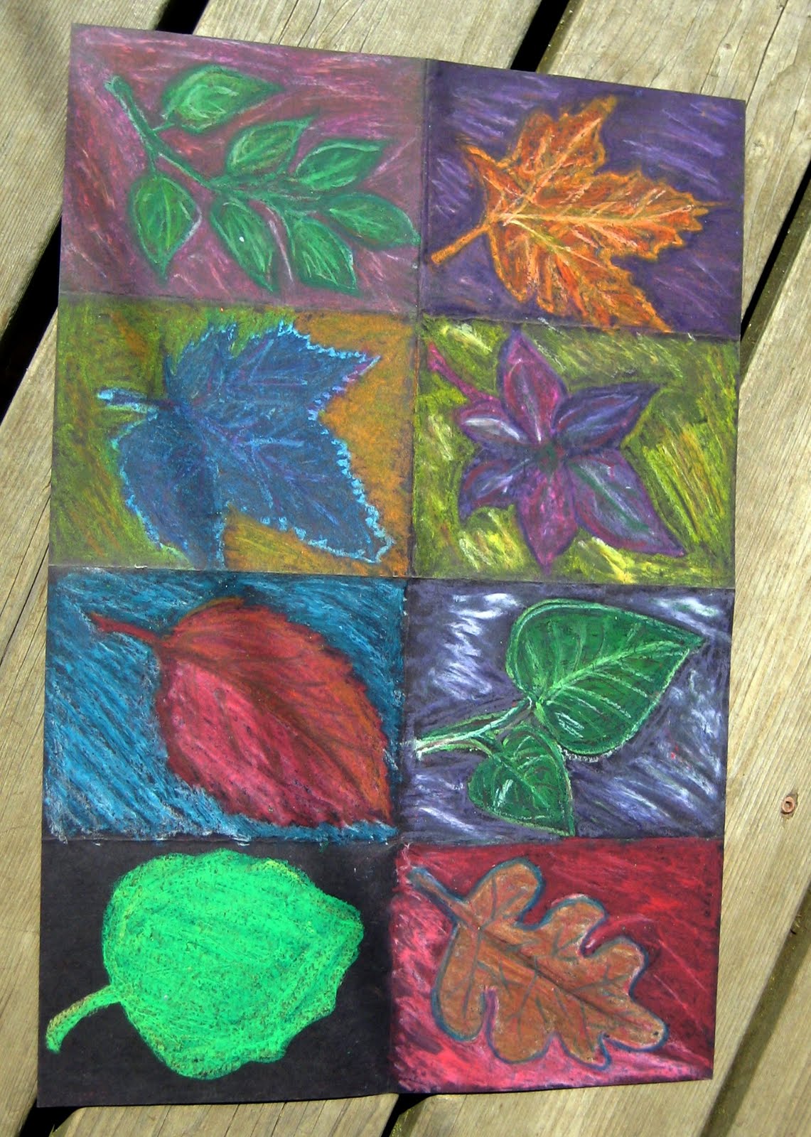
the bucket day 2 - fall oil pastel

A lesson for 3rd grade and up. A good back to school/fall lesson.

Today the bucket brings us another lesson from my student teaching...this one passed on to me from my supervising teacher. I go between liking it and feeling indifferent towards the lesson. And the thing that makes me swing back and forth is the type of oil pastel we use. As I've said before...I hate to call out one brand over another but I find the only oil pastel that really stands out on BLACK are the Crayola hexagon oil pastels. Sorry other brands.

Obviously you can see we have taken a, rather large, sheet of black construction paper and divided it into 8 spaces. Once again size matters. If I were to do this again we would aim for somewhat smaller paper and only six spaces. 6 is great...8 equals burn out. In each example the student burnt out before the end.

The original lesson, as seen above, and flipped because blogger hates me, was intended to be a study of complementary and secondary colors. Students looked at real leaves, drew one in each box and then used oil pastel to explore color. I started requiring white to be used in addition to the color in the background of each box. I also started requiring a neighboring (analogs) color to be used in coloring the leaf itself in each box.
These small changes made a big difference in the visual interest of the work.


Now if we go back to this sample...done with 7th graders, you can see I had branched out into other fall items such as mums and zinnias, gourds and a hard to ID wheat stalk. I feel the gourds and zinnias made a great addition to the leaves as they still have simple shapes but things like the wheat stalk and whatever blue flower was drawn in the upper left hand corner are getting to detailed and monochromatic.

Overall thoughts:
*Pick your oil pastels wisely and test on black paper first
*Go for a slightly smaller sheet of construction paper
*Divided into six instead of 8 boxes
*Draw your item big enough to almost fill the box
*Arrange items at an angle if possible
*Stick with bold, simple shaped fall items: leaves, gourds, sunflowers, zinnias
*Outline the edges of your item with either a dark color or white to make it pop
*Emphasize complementary color pairs and secondary color pairs to help the colors pop
*Encourage use of white in the background at the end
*Encourage use of either a analogous color or tints and shades of the main color inside the leaves